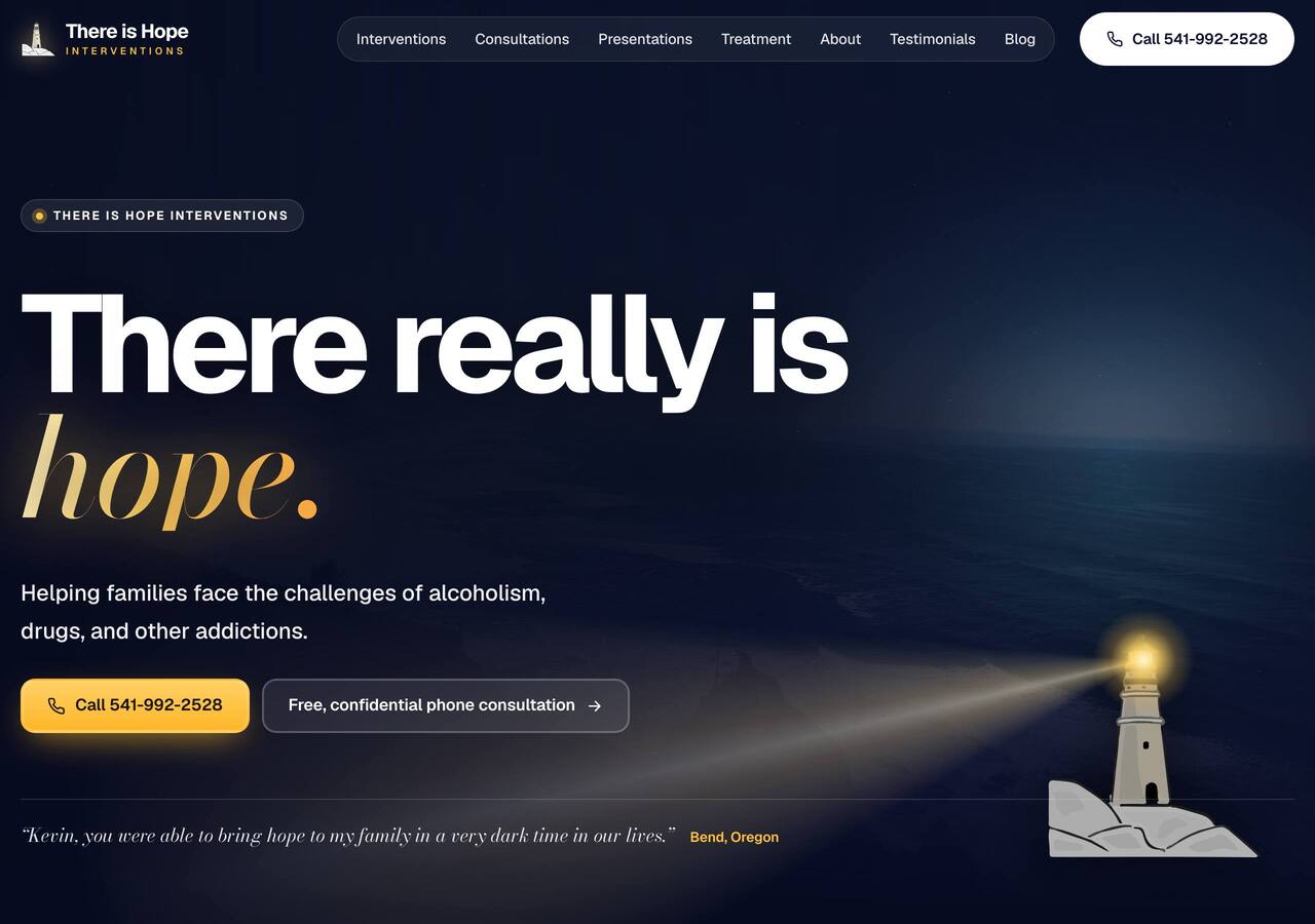
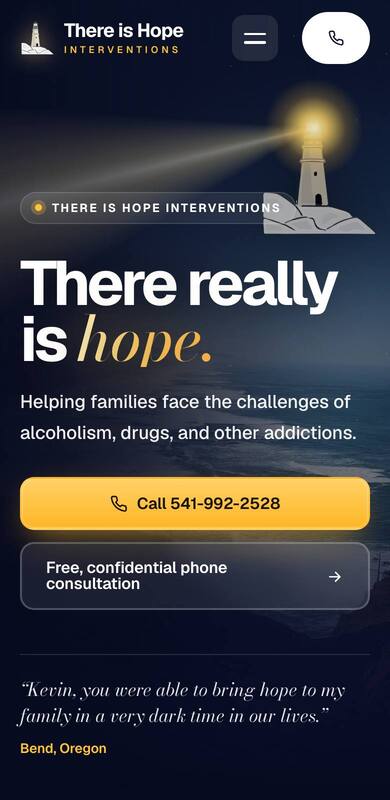
Lightkeeper
The most modern of the four. The page travels from night to daybreak as you scroll: your lighthouse sweeps the dark coast, your own story lights up line by line, the four steps glide past like a coastline, and the contact form waits in full sun.
Feels: fresh, hopeful, unforgettable.
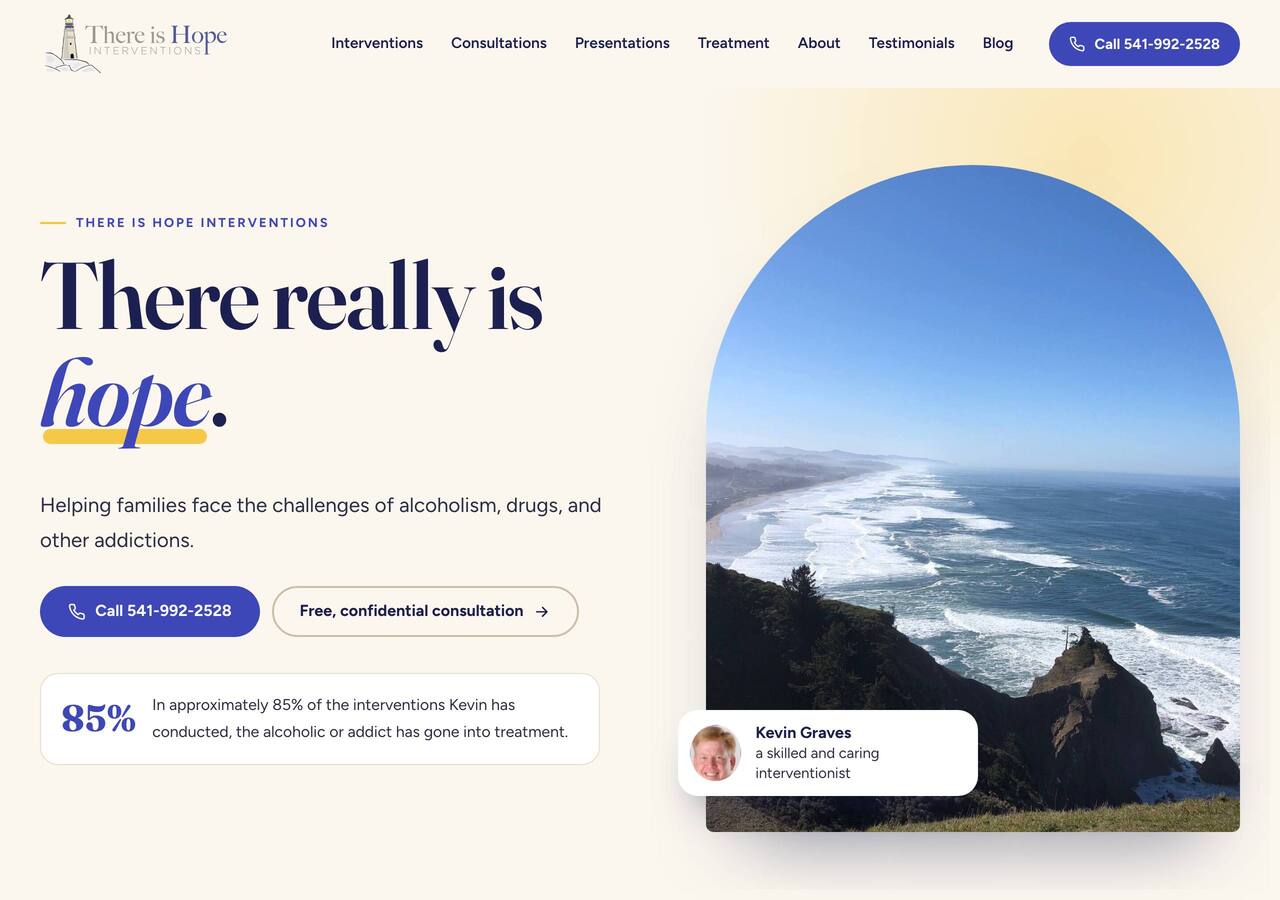
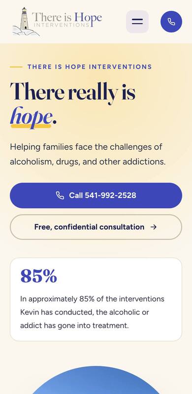
Beacon
Your lighthouse logo, brought to life. Warm and classic, in the logo’s own indigo with a beacon-gold glow and a slow sweep of light over the Oregon coast.
Feels: trustworthy, calm, established.
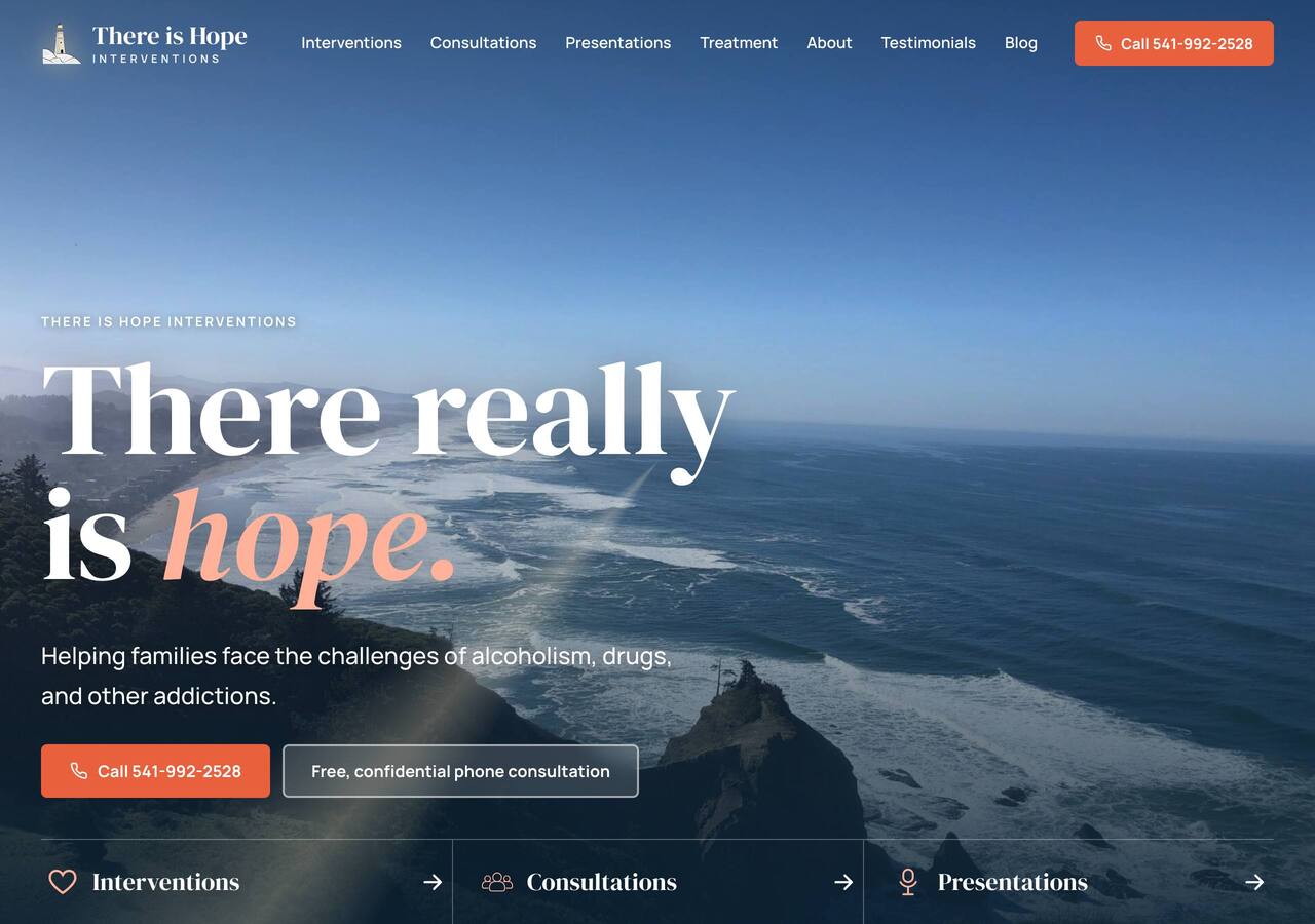
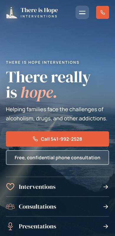
Coastline
Bold and cinematic. The coast fills the whole screen, your words light up one by one as visitors scroll, and families’ thank-you notes drift across the page.
Feels: strong, modern, moving.
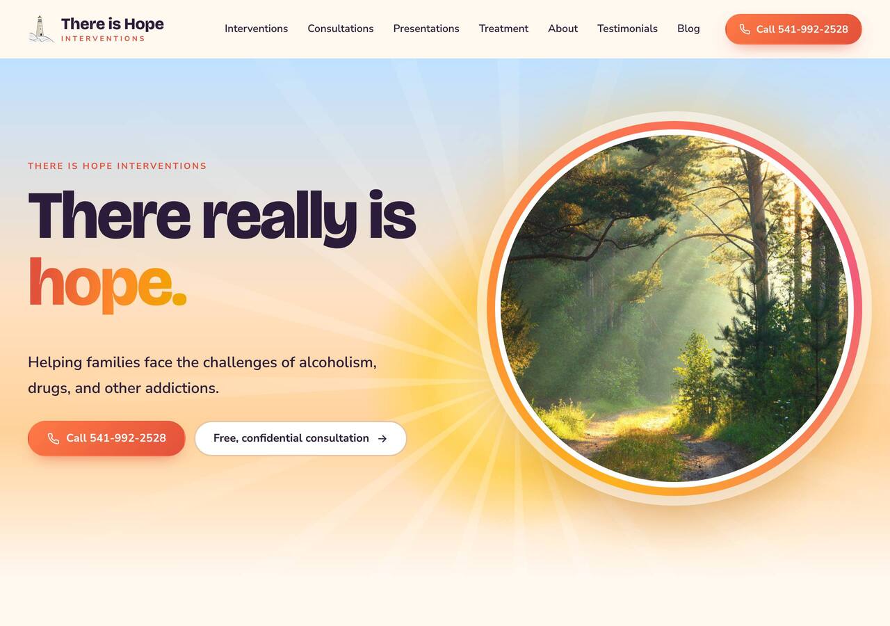
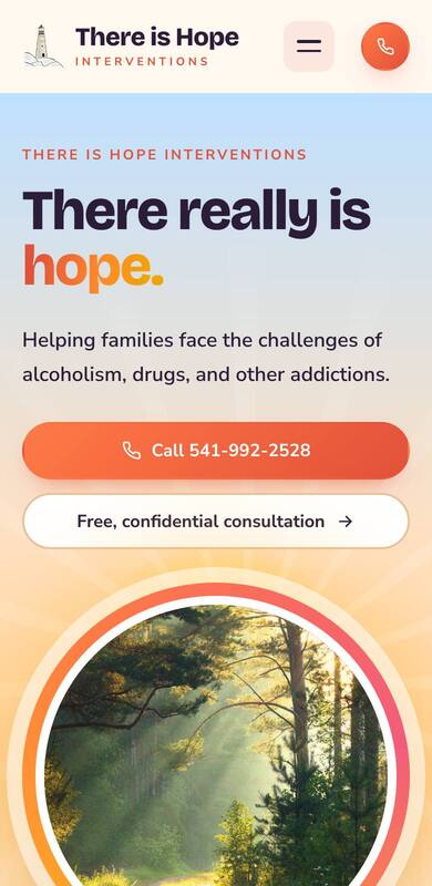
Sunrise
Hope as a new day. A rising sun, bright warm colour, and the four steps of an intervention laid out along a path that draws itself as you scroll.
Feels: uplifting, friendly, encouraging.